Health Sciences Library
Redesigning the Health Sciences Library Website to Improve User Navigation and Flow

Overview
Role
Duration
UX Designer
The University of Washington Health Sciences Library website is used by a plethora of user groups, including medical and dental school students, healthcare professionals, and medical school faculty and staff. The website has not been redesigned in over two decades, resulting in a very chaotic homepage and navigation.
The website experiences a high user exit rate with visitors feeling disoriented and overwhelmed when using the website. Users have difficulty finding the resources they need and are unaware that many tools and resources on the website exist.
Decrease bounce rates and improve user satisfaction by simplifying the homepage and navigation so users can find resources more easily.
Before (web version)
After (web version)
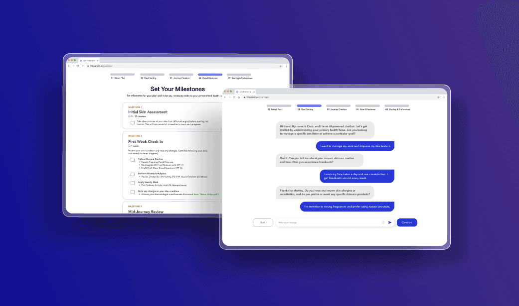
LifePattern AI's main goal is to improve patient outcomes and experiences by creating personalized healthcare journeys using artificial intelligence. Users have reported that the process of building a healthcare journey is complicated and time-consuming, resulting in low conversion rates.
LifePattern AI's main goal is to improve patient outcomes and experiences by creating personalized healthcare journeys using artificial intelligence. Users have reported that the process of building a healthcare journey is complicated and time-consuming, resulting in low conversion rates.
Increase conversion rates and improve customer satisfaction by simplifying the process with a more intuitive design, offering step-by-step guidance and reducing the number of steps required.
Miro, Figma
Context
Role
Duration
The healthcare industry faces numerous challenges, including long waiting times for consultations, high costs of appointments and treatments, and a lack of personalized medical attention. LifePattern AI is a healthcare technology platform that leverages artificial intelligence to provide personalized and data-driven healthcare solutions.
LifePattern AI's main goal is to improve patient outcomes and experiences by creating personalized healthcare journeys using artificial intelligence. Users have reported that the process of building a healthcare journey is complicated and time-consuming, resulting in low conversion rates.
Solution
Increase conversion rates and improve customer satisfaction by simplifying the process with a more intuitive design, offering step-by-step guidance and reducing the number of steps required.
The University of Washington Health Sciences Library website it used my a plethora of user groups, including medical and dental school students, healthcare professionals, and medical school faculty and staff. The website has not been redesigned in over two decades, resulting in a very chaotic homepage and navigation.
The website experiences a high user exit rate with visitor feeling disoriented and overwhelmed when using the website. Users have difficulty finding the resources they need and are unaware that many tools and resources on the website exist.
The website experiences a high user exit rate with visitor feeling disoriented and overwhelmed when using the website. Users have difficulty finding the resources they need and are unaware that many tools and resources on the website exist.
Decrease bounce rates and improve user satisfaction by simplifying the homepage and navigation so users can find resources more easily.
UX Designer
18 months
Figma
Tools
Context
Problem
Solution
Dec. 2023 — June 2024
Tools
Figma
Problem
The University of Washington Health Sciences Library website it used my a plethora of user groups, including medical and dental school students, healthcare professionals, and medical school faculty and staff. The website has not been redesigned in over two decades, resulting in a very chaotic homepage and navigation.
Overview


After (Web Version)
Before (Web Version)
The website experiences a high user exit rate with visitor feeling disoriented and overwhelmed when using the website. Users have difficulty finding the resources they need and are unaware that many tools and resources on the website exist.
Decrease bounce rates and improve user satisfaction by simplifying the homepage and navigation so users can find resources more easily.
Before (Web Version)
Running a Design Audit
In order to familiarize myself with the website, I conducted a thorough design audit and heuristic evaluation to understand the design and functionality of the website.
Conducting A COMPREHENSIVE REVIEW
Lack of aesthetic and minimalism design — homepage is very cluttered and disorganized
Information is not arranged in a natural or logical order
Difficult and inefficient to use for new users
Running a Design Audit
Running a Design Audit
In order to familiarize myself with the website, I conducted a thorough design audit and heuristic evaluation to understand the design and functionality of the website.
Conducting A COMPREHENSIVE REVIEW
Lack of aesthetic and minimalism design — homepage is very cluttered and disorganized
Lack of aesthetic and minimalism design — homepage is very cluttered and disorganized
Information is not arranged in a natural or logical order
Information is not arranged in a natural or logical order
Difficult and inefficient to use for new users
Difficult and inefficient to use for new users
Interviewing Students and Faculty
Interviewing Students and Faculty
Running a Design Audit
01
02
03
Homepage is very overwhelming and cluttered — more portals and a more simple design would be helpful
Students do not know what a lot of the links and resources displayed are — not enough information provided
Would like easier navigation to research guides and research resources
For this redesign, I conducted 10+ semi-structured interviews with students using the Health Sciences Library to learn about what they used the website for and their pain points when using the website.
For this redesign, I conducted 20+ semi-structured interviews with students using the Health Sciences
Library to learn about what they used the website for and their pain points when using the website.
In order to familiarize myself with the website, I conducted a thorough design audit and heuristic evaluation to understand the design and functionality of the website.
I also conducted 7+ semi-structured interviews with librarians and faculty of the Health Sciences Library to learn about their pain points and desires.
01
Librarians enjoy the quick links to resources displayed on the homepage
Desire a more noticeable search feature with simple access to digital books, site browsing, and scholarly articles
02
03
I also conducted 7+ semi-structured interviews with librarians of the Health Sciences Library to learn about their pain points and desires.
Information is not arranged in a natural or logical order
EMPATHIZING THROUGH RESEARCH
CONDUCTING A COMPREHENSIVE REVIEW
Homepage is very overwhelming and cluttered — more portals and a more simple design
would be helpful
Desire a more noticeable search feature with simple access to digital books, site browsing, and scholarly articles
Lack of aesthetic and minimalism design — homepage is very cluttered and disorganized
Difficult and inefficient to use for new users
Conducting Research
Research links and resources are scattered throughout the website
Iteration 1
Central search bar makes it easier and quicker for students to find what they're searching for
The quick links under research are easily accessible and helpful for users
Resources and Faculty tabs are hidden and not noticeable by users
Research links and resources are scattered throughout the website
Conducting Usability Tests with Students
01
02
03
When conducting usability testing on my wireframes with students and librarians, I conducted moderated qualitative testing. This allowed me to observe students and librarians’ actions and reactions when navigating the website and completing common tasks.
04
eBooks and Databases are difficult to find
Differences between Services and Tools subpages aren’t clear
Toolkit page is very overwhelming — very few of the many links are used and they’re difficult to find among all the links
Popular resources bar is hard to read through quickly and makes the homepage look cluttered
Research links and resources are scattered throughout the website
Interviewing Students and Faculty
01
02
03
For this redesign, I conducted 10+ semi-structured interviews with students using the Health Sciences Library to learn about what they used the website for and their pain points when using the website.
01
02
03
Homepage is very overwhelming and cluttered — more portals and a more simple design would be helpful
CONDUCTING RESEARCH
Students do not know what a lot of the links and resources displayed are — not enough information provided
Research links and resources are scattered throughout the website
I also conducted 7+ semi-structured interviews with librarians of the Health Sciences Library to learn about their pain points and desires.
Librarians enjoy the quick links to resources displayed on the homepage
Would like easier navigation to research guides and research resources
Desire a more noticeable search feature with simple access to digital books, site browsing, and scholarly articles
Research links and resources are scattered throughout the website

Understanding How Users Think
Understanding How Users Think
Understanding How Users Think
I facilitated 15 card sorting sessions with students and staff to gain insights into how users think and categorize library information. I did a hybrid card sorting method to allow for a mixture of structure and flexibility for participants.
I facilitated 15 card sorting sessions with students and staff to gain insights into how users think and categorize library information. I did a hybrid card sorting method to allow for a mixture of structure and flexibility for participants.
Conducting Research

Looking at Technical Constraints
When conducting usability testing on my wireframes with students and librarians, I conducted moderated qualitative testing. This allowed me to observe students and librarians’ actions and reactions when navigating the website and completing common tasks.
Building Out Higher Fidelity Wireframes

Looking at Technical Constraints
Looking at Technical Constraints

After analyzing the card sorting results and understanding how users grouped Health Sciences Library resources, I collaborated with developers and content designers to create a user journey map that aligned with our website’s technical constraints.
After looking at other library websites, I began to get a general idea of what pages and subpages I wanted the website to have. I created an information architecture map to help me determine what resources and features would go where on the website.
After looking at other library websites, I began to get a general idea of what pages and subpages I wanted the website to have. I created an information architecture map to help me determine what resources and features would go
where on the website.
Looking At Similar Websites
Looking At Similar Websites

Conducting research allowed me to get a general idea of what Health Science Library users wanted to see on the website and I began to look at other Universities’ Health Science Libraries to get an idea of how they organized their resources. This gave me a general idea of layout designs and allowed me to identify strengths and weaknesses in different layouts.
Exploring Solutions
Conducting research allowed me to get a general idea of what Health Science Library users wanted to see on the website and I began to look at other Universities’ Health Science Libraries to get an idea of how they organized their resources. This gave me a general idea of layout designs and allowed me to identify strengths and weaknesses in different layouts.
Ideate
Looking at Technical Constraints
Iteration 1
Iteration 2

I created low-fidelity mockups to gather early feedback from developers, students, and staff. Each draft explored different ways of organizing the same core functionality to identify the most intuitive layout.
Creating Prototypes AND GETTING FEEDBACK
Central search bar makes it easier and quicker for students to find what they're searching for
Resources and Faculty tabs are hidden and not noticeable by users
The quick links under research are easily accessible and helpful for users
The boxes for research, resources, and services provide clear access to links
The search bar seems more intuitive as users can see the different item selections rather than a drop-down
Popular resources and services on the side can be easy to miss as users scroll down
Design feels slightly cluttered and boxed in

Iteration 2
Popular resources and services on the side can be easy to miss as users scroll down
Design feels slightly cluttered and boxed in
The quick links under research are easily accessible and helpful for users
The search bar seems more intuitive as users can see the different item selections rather than a drop-down
Research links and resources are scattered throughout the website
DELIVERING IMPACT
Central Search Bar
Specific Areas of Interest
Quick Links
Moving the search bar from the navigation bar to the center of the homepage draws users to one of the most prominent features of the website.
Dedicating a "quick links" section on the homepage allows users to find popular links faster. It also allows new users to discover popular resources and services.
Creating three distinct subpages users can navigate to (research, resources, and services) allows users to get a broad overview of the different information the Health Sciences Library offers.
Research links and resources are scattered throughout the website

Central Search Bar
Locked Icons
Popular Databases
Mirroring the homepage and creating a central search bar for the Databases page allows users to search for specific tools easily.
Designating the right side of the page to popular databases allows users to find most used databases faster. It also allows new users a starting point to learn more about popular resources.
Adding locked icons next to databases allows users to easily view which databases require access and which are publicly available.
Research links and resources are scattered throughout the website

Building Out Higher Fidelity Wireframes
Building Out Higher Fidelity Wireframes
After getting initial feedback from low-fidelity designs, I began to flesh out higher fidelity wireframes of the homepage and main subpages, such as research, databases, and toolkits.
When conducting usability testing on my wireframes with students and librarians, I conducted moderated qualitative testing. This allowed me to observe students and librarians’ actions and reactions when navigating the website and completing common tasks.
User Testing
I created low-fidelity mockups to gather early feedback from developers, students, and staff. Each draft explored different ways of organizing the same core functionality to identify the most intuitive layout.
CREATING PROTOTYPES AND GETTING FEEDBACK
Iteration 1
Iteration 1
Iteration 1
Iteration 2
I created low-fidelity mockups to gather early feedback from developers, students, and staff. Each draft explored different ways of organizing the same core functionality to identify the most intuitive layout.
Creating Prototypes AND GETTING FEEDBACK
The quick links under research are easily accessible and helpful for users
The boxes for research, resources, and services provide clear access to links
Resources and Faculty tabs are hidden and not noticeable by users
Central search bar makes it easier and quicker for students to find what they're searching for
The search bar seems more intuitive as users can see the different item selections rather than a drop-down
Popular resources and services on the side can be easy to miss as users scroll down
Design feels slightly cluttered and boxed in
Iteration 1
Iteration 1
Conducting Usability Tests with Students
Conducting Usability Tests with Students
01
02
03
Differences between Services and Tools subpages aren’t clear
Toolkit page is very overwhelming — very few of the many links are used and they’re difficult to find among all the links
eBooks and Databases are difficult to find/navigate to
eBooks and Databases are difficult to find
04
Popular resources bar is hard to read through quickly and makes the homepage look cluttered
When conducting usability testing on my wireframes with students and librarians, I conducted moderated qualitative
testing. This allowed me to observe students and librarians’ actions and reactions when navigating the website and
completing common tasks.
When conducting usability testing on my wireframes with students and librarians, I conducted moderated qualitative testing. This allowed me to observe students and librarians’ actions and reactions when navigating the website and completing common tasks.
Testing & Refining
User Testing
Delivering Impact
Central Search Bar
Central Search Bar
Central Search Bar
Central Search Bar
Popular Databases
Popular Databases
Central Search Bar
Locked Icons
Locked Icons
Quick Links
Specific Areas of Interest
Moving the search bar from the navigation bar to the center of the homepage draws users to one of the most prominent features of the website.
Mirroring the homepage and creating a central search bar for the Databases page allows users to search for specific tools easily.
Designating the right side of the page to popular databases allows users to find most used databases faster. It also allows new users a starting point to learn more about popular resources.
Adding locked icons next to databases allows users to easily view which databases require access and which are publicly available.
Dedicating a "quick links" section on the homepage allows users to find popular links faster. It also allows new users to discover popular resources and services.
Creating three distinct subpages users can navigate to (research, resources, and services) allows users to get a broad overview of the different information the Health Sciences Library offers.
Actionable Milestones
Reflection
Biggest Challenge
The biggest obstacle I faced when tackling this project was effectively designing the homepage to cater to both students and librarians who use the website. Students and librarians are the two main user groups of the website and both user groups were interested in seeing vastly different designs on the homepage.
Takeaway
One important takeaway I learned from this project is that it’s important to get feedback early and often from diverse stakeholders. Without the many, many feedback I received from students, librarians, and faculty along the way, this redesign would not have been anywhere near as successful or polished as it turned out.
Next Steps
The next step in this project is to incorporate the usability testing feedback into my current designs. Looking at the analytics of the redesigned homepage and subpages would also be future steps as I plan on furthering iterating on pages with low retention rates and high bounce rates.
let's connect
Doankn2602@gmail.com
let's connect
Doankn2602@gmail.com
let's connect
Doankn2602@gmail.com
Health Sciences Library
Health Sciences Library
LifePattern AI's main goal is to improve patient outcomes and experiences by creating personalized healthcare journeys using artificial intelligence. Users have reported that the process of building a healthcare journey is complicated and time-consuming, resulting in low conversion rates.
LifePattern AI's main goal is to improve patient outcomes and experiences by creating personalized healthcare journeys using artificial intelligence. Users have reported that the process of building a healthcare journey is complicated and time-consuming, resulting in low conversion rates.
Increase conversion rates and improve customer satisfaction by simplifying the process with a more intuitive design, offering step-by-step guidance and reducing the number of steps required.
Miro, Figma
The healthcare industry faces numerous challenges, including long waiting times for consultations, high costs of appointments and treatments, and a lack of personalized medical attention. LifePattern AI is a healthcare technology platform that leverages artificial intelligence to provide personalized and data-driven healthcare solutions.
Increase conversion rates and improve customer satisfaction by simplifying the process with a more intuitive design, offering step-by-step guidance and reducing the number of steps required.
Figma
Redesigning the Health Sciences Library Website to Improve User Navigation and Flow
Iteration 1
Iteration 2
I created low-fidelity mockups to gather early feedback from developers, students, and staff. Each draft explored different ways of organizing the same core functionality to identify the most intuitive layout.
Creating Prototypes AND GETTING FEEDBACK
The quick links under research are easily accessible and helpful for users
The boxes for research, resources, and services provide clear access to links
Resources and Faculty tabs are hidden and not noticeable by users
Central search bar makes it easier and quicker for students to find what they're searching for
The search bar seems more intuitive as users can see the different item selections rather than a drop-down
Popular resources and services on the side can be easy to miss as users scroll down
Design feels slightly cluttered and boxed in